Layout Testing with Chrome Development Tools
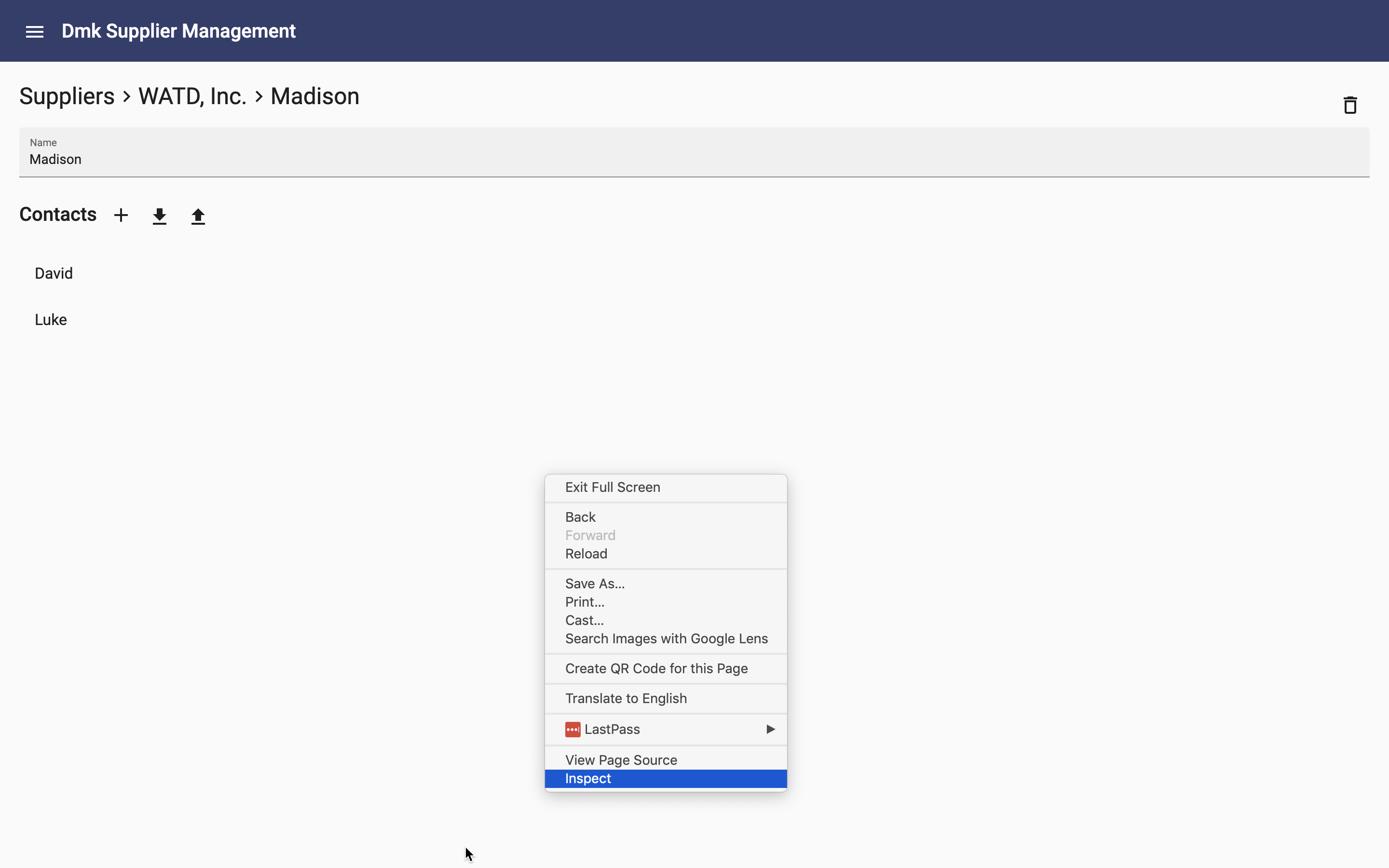
The majority of testing for mobile is testing responsive layouts. This can be easily done using Chrome Developer Tools. Right click on the app's page and select inspect:
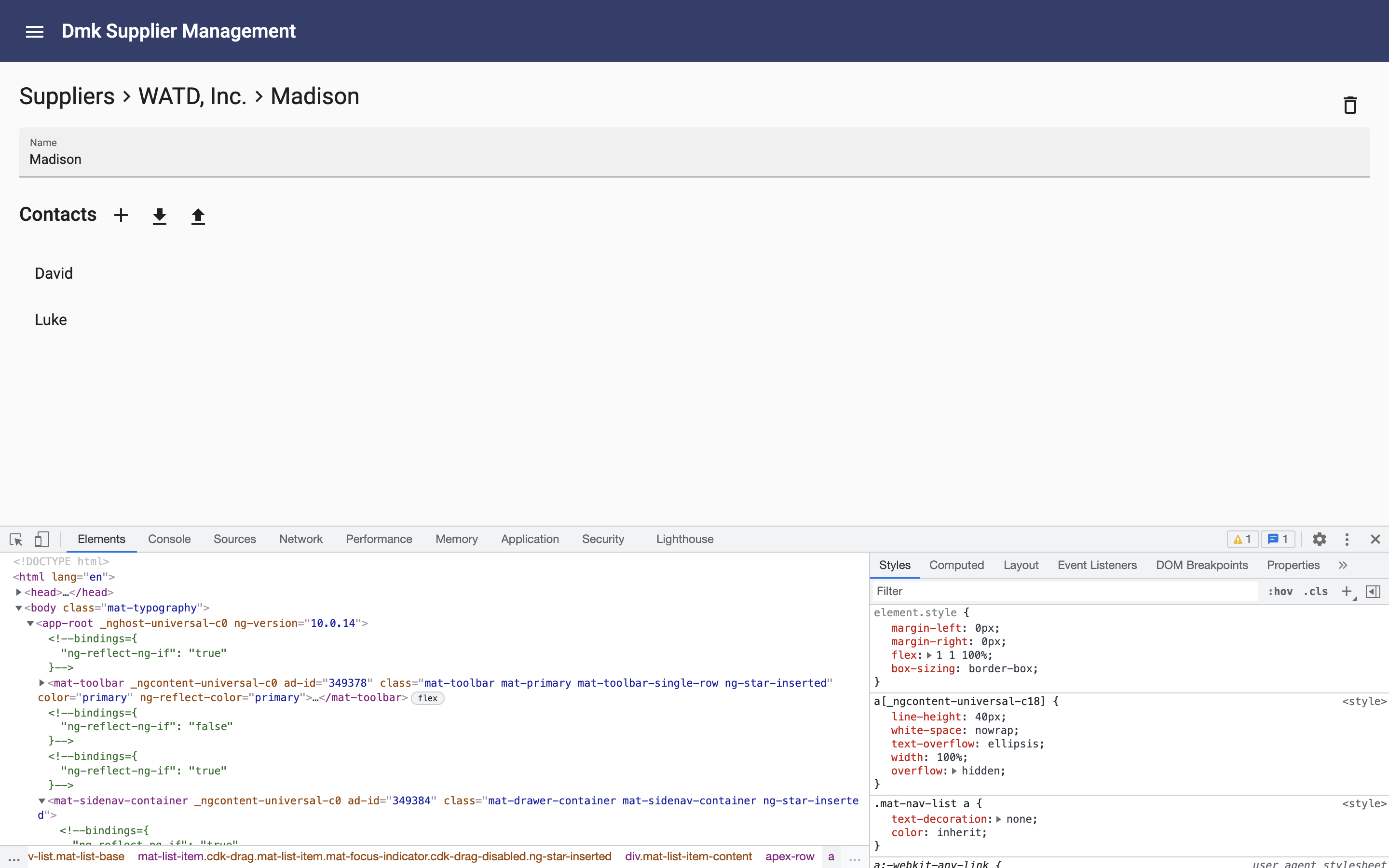
The Developer Tools will be shown at the bottom of the screen:
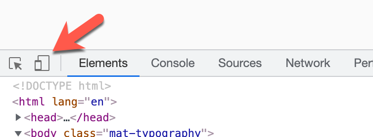
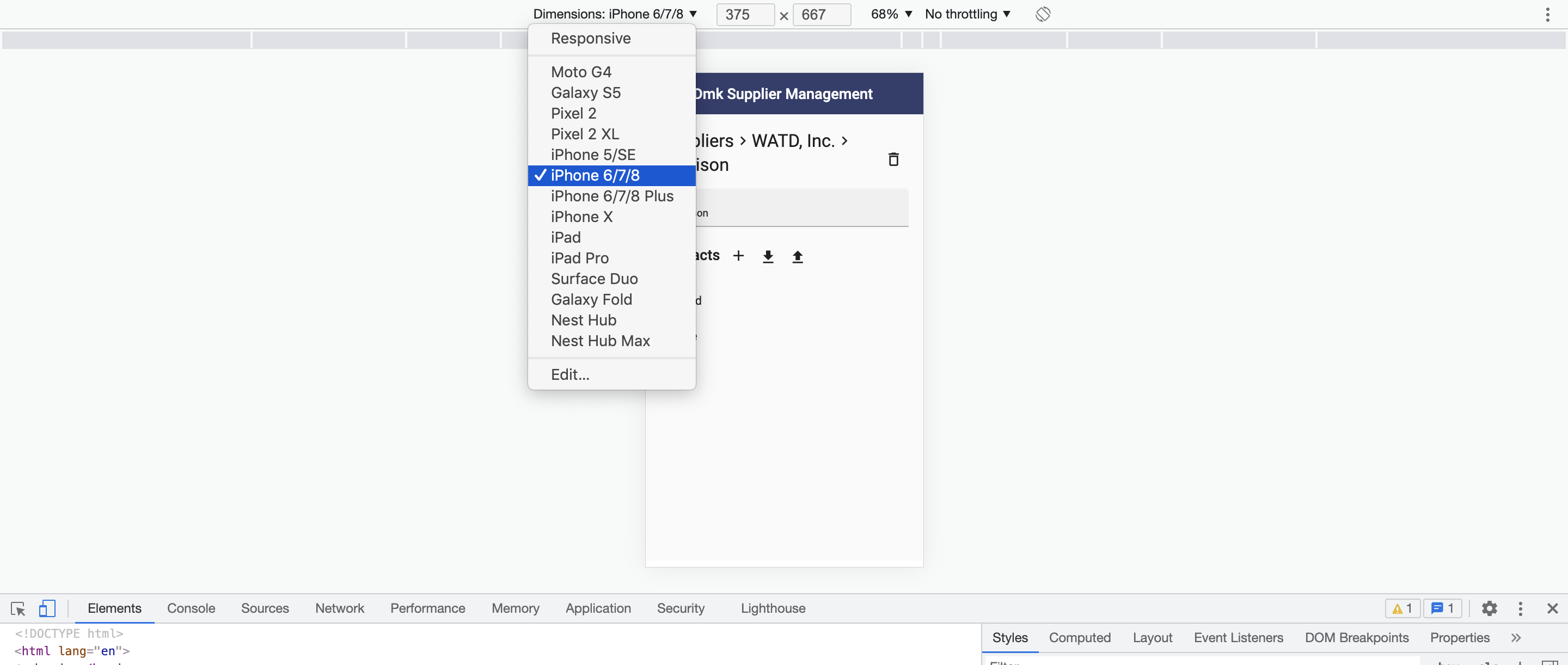
Click on the "Toggle device toolbar" icon button:
The app will be displayed as it will appear on devices of various sizes:
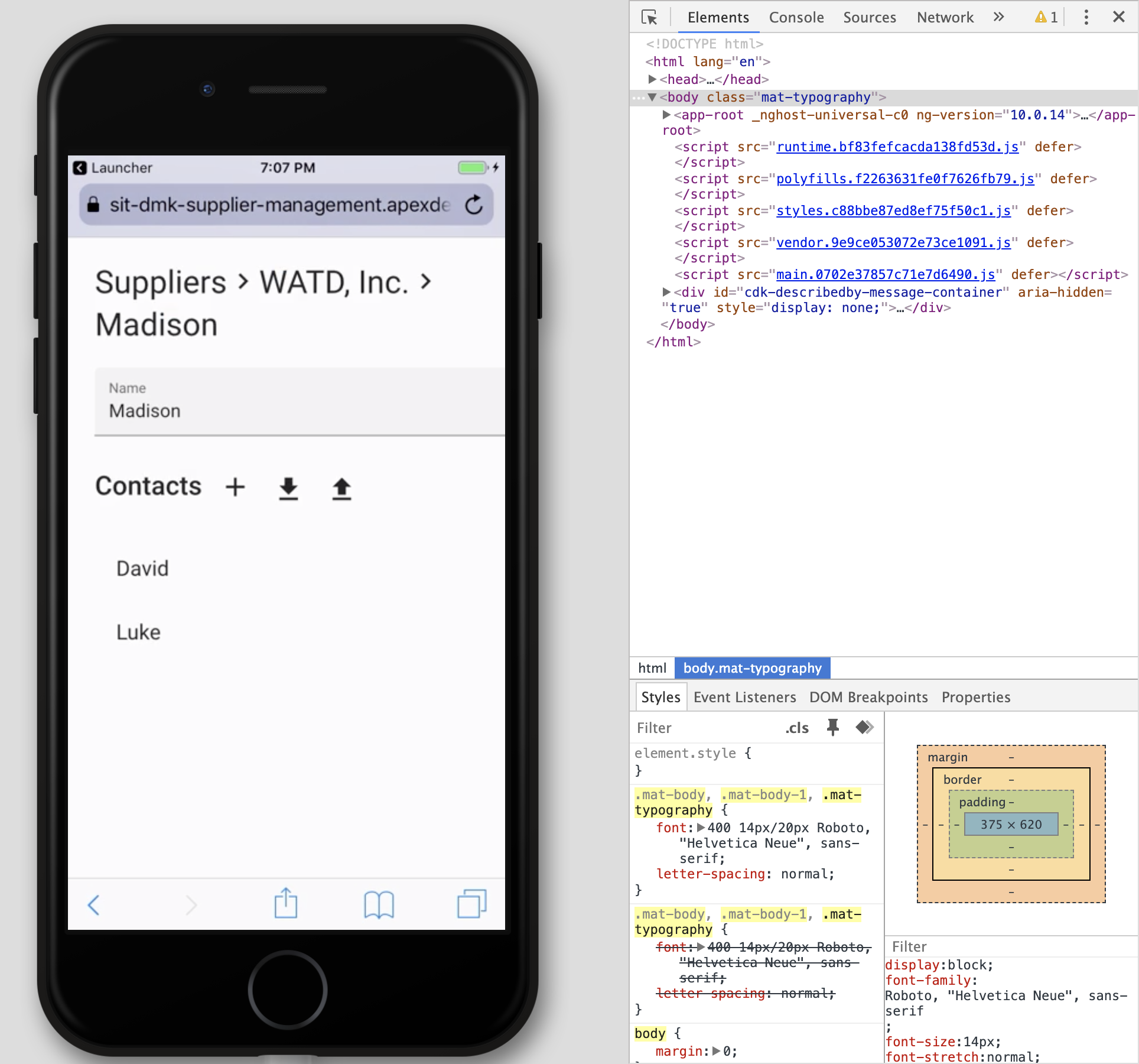
Testing on Real Devices
You should also do testing on real devices. You can test with your own phone by opening the app url in the phone's browser:
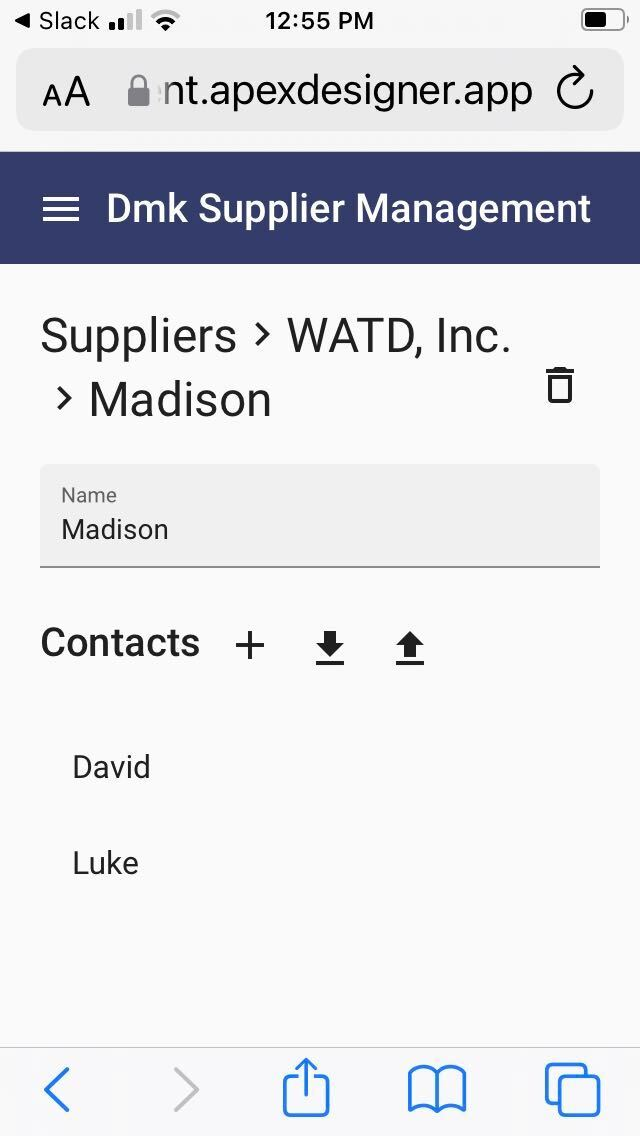
The main shortcoming is that it is difficult or impossible to get to the developer tools to inspect elements and view debug.
Testing on Real Devices with Browser Stack
BrowserStack lets you pick a device and browser:
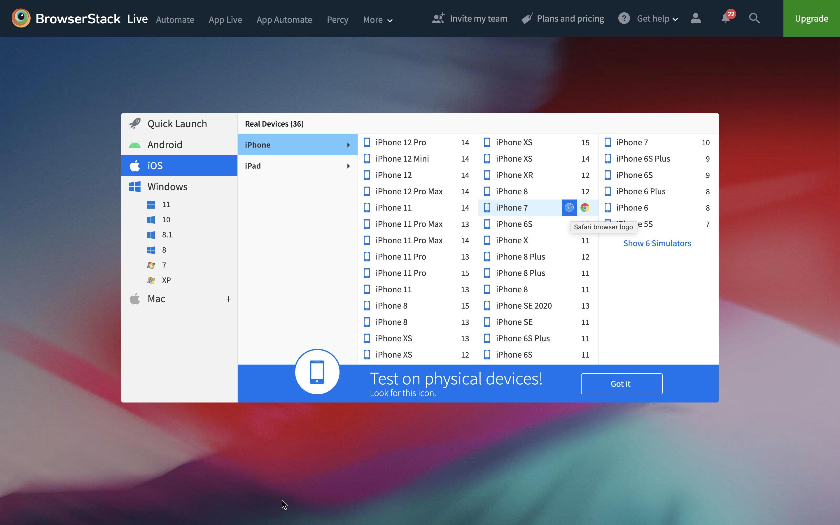
And it runs the app on a real phone with access to developer tools: