

This page covers three ways to adjust layout for mobile devices (from simplest to most powerful):
- Wrap Component
- Angular Flex-Layout Directives
- Conditional Components
Wrap
The simplest way to adjust layout of items for a smaller screen is the Wrap Component in the Dynamic Components Library. Wrap will lay out fields or cards in a grid of equal widths based on the size of the screen. You simply put the items inside the Wrap component and specify the widths for each Angular Flex-Layout breakpoint.
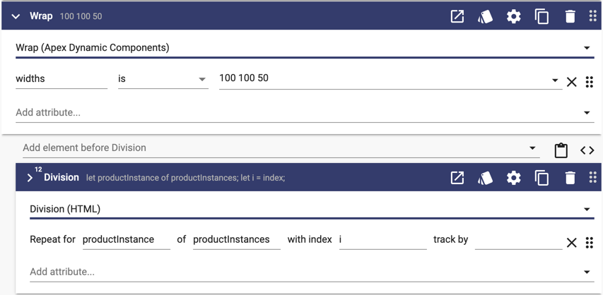
In the example above, the "100 100 50" widths means that each product instance will be 100% of the width for extra small (xs) and small(sm) and will be 50% of the width for everything larger.
Angular Flex-Layout Directives
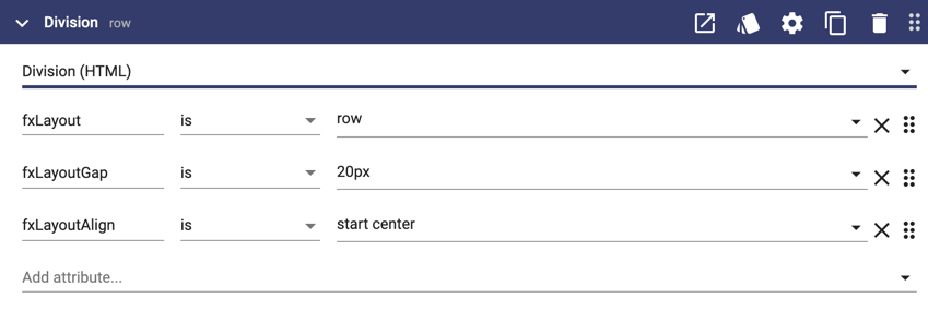
If you need more control over the layout of the items, you can use the Angular Flex-Layout directives. This section contains a few examples showing common patterns. Here is a div that will position its children in a row with a 20px gap between them with each child will be left aligned horizontally and centered vertically:
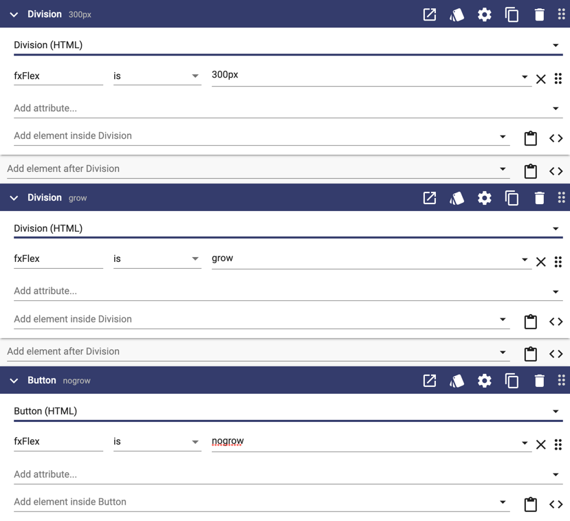
Here are the three children with the left div set to 300px wide, the button set to not grow, and the middle div set to use the remaining space:
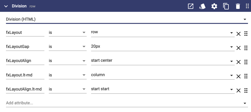
You can add suffixes to the directives to provide different values by screen size. Here is a div that is a row for screen sizes medium (md) and larger and a column for screen sizes smaller:
There are other many other options including hide/show, reorder, and offset. See Angular Flex-Layout directives for all the details.
Conditional Components
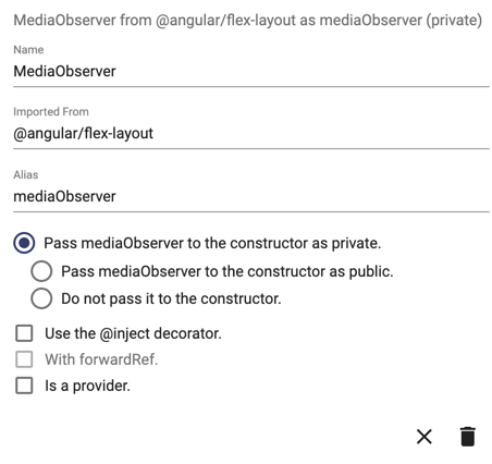
The third pattern is to use the Angular Flex-Layout MediaObserver to set UI properties and then apply conditional logic to the elements. Start by adding the MediaObserver class as a dependency for your UI:
Then create a UI method that runs on load something like this:
this.subscriptions.push(
	this.mediaObserver.media$.subscribe((mediaInfo) => {
		debug('mediaInfo', mediaInfo);
		this.isMobile = mediaInfo.mqAlias == 'xs' || mediaInfo.mqAlias == 'sm';
	})
);
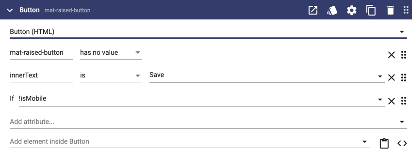
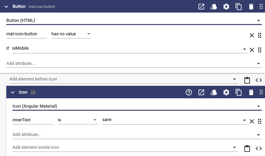
Then apply conditional logic to the components like this:
Remember to clean up your subscriptions.